Vancouver-based Capella Design creates stylish mobility products for at home

Reviews and recommendations are unbiased and products are independently selected. Postmedia may earn an affiliate commission from purchases made through links on this page.
Article content
Turning reflections into actions
In March 2022, amid the global slowdown, Kaly Ryan launched Vancouver-based Capella Design. Ryan is an industrial designer and previously co-founded design company, Willow & Stump.
Article content
Capella is the result of Ryan taking the time to reflect on what she really wanted to do with her design and fabrication talents, and her thoughts travelled back to the effort her parents went to — in the 80s and 90s — to modify her grandfather’s house so he could stay there as long as possible. He stayed in his own home until he was 95 years old.
Advertisement 2
Article content
It was difficult then, and it’s difficult now to find functional products that assist people with mobility needs at home that also look good, modern and aesthetically pleasing.
A lot of mobility products, though functional, are downright depressing to look at, and people don’t really want them in their homes, says Ryan.

Ryan also thought about her mother, who is now in her 70s and wants to stay in her own home as long as possible.
Ryan’s mum is part of a small group of people (around 10 per cent, if you go by a recent Forbes article — referencing the United States population) preparing to age in their homes. What’s interesting, says Ryan, is a recent survey by the Canadian Medical Association and National Institute on Ageing found that “96 per cent of Canadians want to age at home and live independently for as long as possible.”
“So there’s this huge gap between people who want it and are ready,” she says.
Before launching Capella Design, Ryan had some experience designing a health-related product. At Willow & Stump, she helped design its Perk Lamp, which was created to help people with seasonal affective disorder.
Article content
Advertisement 3
Article content
Shower seat, not bench
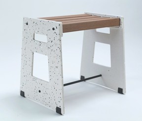
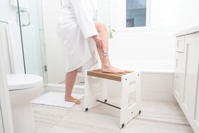
It took Ryan two years to create Capella’s Lotic Shower Seat. She researched shower chairs and shower benches and was driven by a desire to redesign this often unattractive product.
“Realistically, you and I might need a shower stool tomorrow if we tripped and hurt ourselves. It doesn’t hurt to have these kinds of mobility products at home, but people don’t want to put them in their homes because they’re really ugly. They don’t always make you feel good about yourself,” she says.
Capella’s shower seat is made from a “solid surface” called Himacs, a stone-like material that looks and feels like stone but is non-porous.

The stool’s slats are made from a composite decking material that is made from recycled plastic, produced by a “great Canadian company called NewTechWood,” says Ryan. “Essentially, you’re sitting on pop bottles that look and feel like wood.”
With mobility design, there is a big difference between following code and considering how a person is actually going to use a space — like a washroom, Ryan explains. Some hotel rooms have showers with bench seats that meet code, but you can’t actually reach the shower controls while sitting on the bench.
Advertisement 4
Article content
“This is one of the reasons we created a stool instead of a bench.”

Design is moving in a mobility-friendly direction
Walk-in showers, with no lip, are Ryan’s favourite trend because they’re easier for people to access, she says.
Contrasting colours is something people don’t often consider, but if you have an entirely white or grey bathroom, it can be challenging for people with vision issues to differentiate the floor from the wall.
“Even for me, if I take off my glasses, I can’t see anything in the shower.”
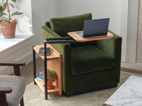
Capella has prototyped a good-looking side table with an adjustable tray, called Corbel. This design has been selected as a WL (Western Living) Design 25 finalist.
“It’s an adjustable side table that sits beside your bed or couch and adjusts up and down and swings in — like a TV tray but modernized,” says Ryan. You can use it to rest your plate, a cup of coffee, or an iPad if you’re FaceTiming someone or your book. “Winning a design-related award for accessible furniture is significant because it solidifies that these products can be seen as beautiful, functional furniture instead of things that are stuck in the mobility store that no one wants to visit.”
Advertisement 5
Article content
Capella is also prototyping a grab-bar picture frame and a more “stable mug option” for people with hand mobility issues.
This mug has a larger handle, more stable base and is made from a light material, so it’s easy to hold,” says Ryan. For a mug, the design is quite elevated, she adds. Which, in design speak, means it looks good. She had ceramicist Grace Lee of Eikcam Ceramics prototype it for her.
“I’m really excited to get it into the hands of people who would use it to get it tested,” says Ryan.
Nothing about us without us
Nailing good design for people with mobility restrictions requires you to put the people you’re designing these products for at the centre of what you’re doing, says Ryan.
She says she isn’t an expert in mobility design; she’s an expert in listening to people and being able to respond.
“It’s all about making sure people who experience disability are central in creating solutions.”
Recommended from Editorial
Article content

